

As a Motion Designer, I find that staying creative requires not only sharpening my motion design skills at my day job, but also looking for opportunities to use it for personal, passion projects. An animated logo for my friend’s short film, a motion poster of a drawing of a friend in full Harry Potter regalia for his Christmas present, whenever there’s a chance to make something cool, I’ll jump at the chance.
SUPERHOT (the all caps is important) is a video game that was released in 2016. It was a first person shooter that featured stark, minimalist 3D angular graphics, amazing slowed motion combat and a punchy soundtrack that kept you moving through its many stages.
In 2017, the makers of SUPERHOT and an online game modding community website www.moddb.com collaborated to host a competition called #MakeItSuperHot. Contestants were invited to either make a game or mod based on the game’s aesthetics and gameplay. They also had a section to create Fan Art for the game. Seeing as I only played video games, not make them, I elected to try my hand at the Fan Art category of the competition.
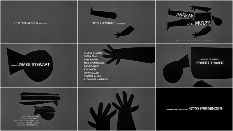
When thinking of what I’d create for my entry, I fell back on my skills as an animator and came up with the angle – if the video game SUPERHOT was a movie, what would its intro sequence look like? As a fan of movie title sequences, from the James Bond films to the Marvel Studios end title sequences, I thought it would be appropriate to make a cool animated intro title sequence for “SUPERHOT – The Movie”.
I sat down and started out by drawing some storyboards about the visual ideas I had in my head, timed to the game’s soundtrack. I loved the rock-and-roll feel, and was thinking of reflecting that in the visuals, but had to keep pulling back and keep the visuals clean and precise, just like the video game art direction itself. I liked the visual idea of having the bullets leave behind a red line, so I had it trail around and form up with other bullets to hit the main title screen of SUPERHOT when the music kicks in.

As I was storyboarding and timing the edits to the music, two problems arose during the pre-production phase:
- I had messaged the developers asking if it was ok that I could use their music for the video, and they didn’t get back to me. So I took that as a no.
- More importantly, I wasn’t feeling the visual direction of the current visuals. I felt it was just a simple rehash of the game visuals itself. Also with what I was proposing with my sketches, the amount of work needed to go into this project was more than what I had time for. If I wanted this to be a movie title intro, I’d have to dig a bit deeper.
I kept watching other movie titles for inspiration, and the one that I kept coming back to was the Father of Film Title Sequences, Saul Bass. His simple 2D constructions struck a chord with me, as it mimicked the game’s bare design. Ultimately it was this influence that made me switch gears.
The visual simplicity of the game itself was what was key to the whole deal. Even though the look was 3D, flat and had simple shaded environments with faceted but plain characters, this meant that the player was not distracted by anything other than what was most important to him. So super red baddies against a grey shaded background. Black fists at the bottom of the screen.
It was with this pairing down of detail that I hit upon the idea that if it’s super simple 3D, the 2D version would of course be simple icons!
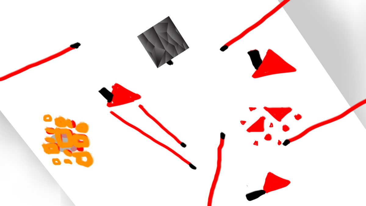
I quickly sketched out what it might look like, initially using a black box as the hero and red triangles as the baddies. The red bullet trails already lent itself well to the flat 2D look. Simple rectangles for guns, round circles for fists, two rectangles for a double barrel shotgun, everything fell into place so easily I couldn’t believe I didn’t think of it first. I definitely owe a lot to the Saul Bass design school of thought for this one.

I created the icons and bullet elements in Adobe Illustrator, before importing and animating them in Adobe After Effects. Initially I had used a black square for the main hero, but switched it to a black triangle, as it was helpful to know which way the icon was facing and the square wasn’t going to accomplish that.The triangle debris was animated using Trapcode Particular.
I submitted my completed project to the competition with the satisfaction that, whether I win or not, the experience pushed me to try something different and creative and for that, I was pretty grateful and delighted with the outcome.
Having said that winning 2nd place certainly helped with the satisfaction of a job well done.